22 October 2007

I love the city at night!

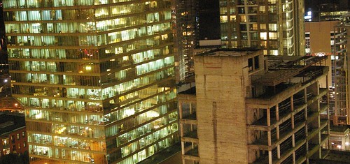
Here are some pictures I took on my walk home this evening...

lights
walk
buildings
walk
city at night
night

I love how everything looks lit by fluorescent lights.

Here is an older picture I took last year in Vancouver...
vancouver- skyline

11 October 2007

I love Jamie Rothstein's tabletop designs. She designs for large scale events and galas. She has a unique way of designing flowers-compact groupings leaning in vases. I saw a similar technique used by the floral designer who arranges the flowers for Le Georges V Hotel in Paris.

At the gala pictured below, her floral design is more about instillation, working especially with colour and lighting.


Angling the flowers and repetition are also characteristic of her style as seen below.

4 October 2007

I was introduced to Mail Art in College by my drawing instructor Don Mabie a.k.a. Chuck Stake. He collaborated with my drawing class for the Frontier Mail Art Project, which is now collection of the Glenbow Museum. Each of us were asked to make an 8 1/2"x11" postcard showing what frontier meant to us. Here is the installation from 1998.


My favourite mail art project is Postsecret. People are encouraged to mail in their deepest secrets anonymously on postcards. Periodically, Postsecret takes these submissions and turns them into a book.

30 September 2007

Here is a postcard and poster I designed for an open house we are having at work, inspired by the 50's, pin-up girls, and gossip. The entire storefront has just been remodeled, so we wanted to work in the theme of a make-over as well.

24 September 2007

I have failed to post anything all summer, I have been busy making jewelry, reading and looking into applying for my masters in environmental design. Here are some things that I have been admiring over the past few months...

I made very little art during the summer, but instead made bracelets whenever I had some free time. Pictured below are two of my favourite bracelets. My bracelets are being sold at Capitol Clothing on Broadway.


I have recently fallen in love with French artist Fafi's work!! She has been featured in the last two issues of Nylon magazine. She started off as a graffiti artist, working her way into galleries and now her images are appearing on products for adidas and LeSportsac. She calls her work "girlie art", as the female characters or 'Fafinettes' she paints are extremely feminine and appear in an imaginary world of their own. Pictured below is one of her 'Fafinettes'.


This summer I read two books by Jonathan Safran Foer: Everything is Illuminated and Extremely Loud & Incredibly Close. Becoming a fan, I was interested in his inspiration and style of writing. Similar to his books, Safran's website, the project museum is both visual and non-linear. Foer uses unconventional methods for inspiration, asking participation in different projects. In one particular project, he asked readers to submit pencil-sketched self-portraits, which he later framed to examine at home. I heard one story where he was having writer's block and wrote to renowned authors asking for advise. Most replied with generic letters, but some replied in their own words. I found influence from this in Extremely Loud & Incredibly Close, where the main character, eccentric child Oskar Schell writes to many notorious people asking if he could work under them. In the first chapter, for example, he writes to Stephen Hawking asking if he could be his protege.

I have been looking for architects and designers that I really admire for their ability to incorporate and concentrate on nature and environment, in both the physical and designed context. Here are three that I have found so far:

Site Architecture, Art & Design

One of my favourite designs is their 2004 plan for a residential building in Mumbai, India. It is a multi-tiered structure with landscaping on each level, inspired by the Hanging Gardens of Babylon, including terraces and water features, and maintaining Vastu principles in historic Hindu architecture.

A-Z (Andrea Zittel)

Out of all their designs, A-Z 'Living Units' are my favourite, because of their minimalistic quality. It reminds me of the philosophy of tailoring space to humans' basic needs, similar to that of pioneer-architect Le Corbusier. To deal with housing shortages in urban Paris, Le Corbusier designed 'Immeubles Villas' in 1922 that...was such a project that called for large blocks of cell-like individual apartments stacked one on top of the other, with plans that included a living room, bedrooms, and kitchen, as well as a garden terrace.* Pictured below is an A-Z 'Living Unit'.


Inscape Architecture

For a long time, I have been infatuated with the idea of movable walls, mostly in the residential setting. Inscape Architecture has designed movable walls for the corporate setting. I love that they are glass and allow for natural light to diffuse, while still allowing for versatility in space and privacy needs. This simplicity of design reminds me of the exposed framework and the use of glass to enclose and define space of pioneer-architect Ludwig Mies van der Rohe. Pictured below is an example of Inscape's 'movable walls'.


Inscape Architecture is brilliant at designing office settings, keeping to clean lines and simplicity of materials, and working towards good use of space. Here is another example of their designs, a meeting area and space for filling and storage is pictured below.


*http://en.wikipedia.org/wiki/Le_Corbusier

17 June 2007

Here are some gallery shots from the That's so Gay III show.


Rachelle Soucy’s Vanitas series uses non-traditional photographic methods, lush colours and intriguing symbolism. Emerging out of the darkened background are not only flowers, fruit and trinkets, but the artist herself. In a way, Rachelle’s work is a slick descendant of the “face-down-on-the-photocopier” self portraits most of us have enjoyed. But by using today’s scanner technology, she greatly magnifies hidden details such as wrinkles and pores on her skin and even miniscule insects which apparently were former tenants of the foliage.

While Rachelle credits Vancouver-based artist Evan Lee and British artist Helen Chadwick with the technical inspiration behind the work, even more interesting is her imagery which alludes to various artistic genres and literature. Rachelle captures the morbid symbolism of 16th and 17th Century vanitas still life paintings with wilting flowers, rotting grapes, and an hourglass. The artist herself projects lifelessness by keeping her eyes firmly shut. The vanitas theme reminds the viewer that pleasure is futile and death is inevitable. Despite their foreboding qualities, the images remain undeniably beautiful and hint at a sexual tension. Blushing flower petals rustle open, suggesting a naughty peek under a woman’s shirt, and the flushed skin, tousled hair and parted lips of the artist’s face could be simultaneously interpreted as either qualities of the vanitas theme or lusty indulgences.

I felt that the work’s technique and style could refer to Evergon’s exotic Ramboy series and the recent, collaged photographs of Gilbert and George. I was subsequently reminded of Ophelia, one of Shakespeare’s most tragic heroines, and her mad descent into a watery grave. Most importantly however are Rachelle’s allusions to Lewis Carroll’s Alice in Wonderland books. Tiny tea spoons, white roses, seashells, and the infamously tardy white rabbit all appear to be accompanying Alice as she tumbles endlessly down the rabbit hole.
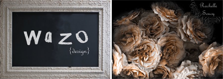
Joseph Anderson

Here are the six works I had in the show - Vanitas series


My process is influenced by Vancouver-based artist Evan Lee. In Canadian Art magazine (winter 2006) there is an article on Evan Lee and his scanner pictures. He sets up still-lifes and uses his scanner as a means to photograph these still-lifes. The effects are somewhat reminiscent of 17th Century Dutch still-life paintings, with beautiful shadows. He uses dollar store trinkets, like tacky silk flowers and plastic bugs, making reference to symbols found in many 17th Century still-life paintings.


When I started working on my artwork for this show, I wanted to create self-portraits incorporating these symbols from 17th Century Dutch still-life paintings or 'vanitas' paintings. At first glance, 'vanitas' makes reference to vanity. I am capturing my youthfulness in the photograph, which could be seen as vain, there are other elements in play within the photograph. Typically 'vanitas' paintings are highly symbolic and are meant as a reminder of the transience of life, the futility of pleasure, and the certainty of death. And it is in these 'vanitas' symbols surrounding my face, like the decaying flowers, skulls, hourglass and seashells, which are meant to symbolize mortality and the passing of life. I am hoping that my photographs show both literally and symbolically like a snapshot in time.


My process of using my scanner as camera was first inspired by Evan Lee. He sets up still-lifes and uses his scanner as camera. I began by scanning objects and then my hands, hair and face. I gradually started experimenting with all the images I had scanned, by combining multiple scans to reveal a larger and more surreal image. By making multiple scans of the flowers, my face and hair, I was able to crop and fit images together to create larger and more dynamic self-portraits. Although the image does accurately capture in fine detail my wrinkles and badly bitten finger nails, I was also able to manipulate it in a way to emphasize other parts of myself, such as my hair. People commented on how long my hair was in some of the portraits, wanting to know if I had been wearing a wig, but it was really just a matter of piecing different scans together to make hyper-portraits of myself.

Rachelle Soucy

25 May 2007

Good News!!! My bracelets are now being sold at Capitol Clothing, a women's boutique located at 102-626 Broadway Avenue, Saskatoon (across from the Broadway Roasterie). Keep checking back at the boutique, because I will be adding new items... Here is one of my favourite bracelets!

12 May 2007

In June, I have artwork in a group show. Here is the invite (click on it to enlarge) ... go check out my scanner photographs, I am planning on showing three large scale photographs-I want to blow them up as large as possible.

7 April 2007

I came across Brazilian designer Maria Elvira Crosara. She designs clothing under the fashion brand Anunciação. One of her techniques is to commission guest artists to design the prints and embroideries used in her clothing. Artist Catalina Estradda's illustrations appear in the winter 07 collection. Her illustrations are seen in the orange and blue dress below.

What is most striking for me is that the print and embroidery seem to be more meaningful in her collections than the actual design of the clothing. The following picture is an example of embroidery on her clothing. Although the jacket is beautiful, it is overshadowed by the the bright embroidery. I do love how much colour she uses in her designs, and I love the playfulness of the prints she selects.


Another designer-team I love is Jovovich-Hawk. I especially like their collection from Fall/Winter 2005. It is so feminine and tom-boyish at the same time!

2 April 2007

Well, I dragged out my sketchbook today, and decided to do a little sketching. I haven't just sketched for the fun of it in a long time, so below are some of what I finished today. Here are some artists I found this week and whose work I love! They are Maria Ikonomopoulou, Kiki Smith, Mar Hernández, Julie West, and Saskatoon-based artists Yuka Yamaguchi and Kristin Bjornerud.

26 March 2007

Here are the scans I finished today. I am still working with 'vanitas' symbols- the flowers, fruit and hourglass; but these newest self-portraits are also Alice in Wonderland inspired. To see more of my scanned images from today and the past few days go here.

24 March 2007

Here are a few more of my attempts at self-portraits. I added a skull-like rosary as a reference to momenti mori. The skull, dying flowers, and seashells are symbols used in many vanitas paintings.

23 March 2007

I have started working on my piece for a group show in June at the Snelgrove Gallery. I will have three self-portraits based on 17th Century Dutch still-life paintings, also known as vanitas. Typically vanitas paintings are highly symbolic and are meant as a reminder of the transience of life, the futility of pleasure, and the certainty of death. Pictured below is my first try at scanning myself with flowers. I want to somehow include more vanitas symbols, such as skulls, hourglasses, bugs, rotting fruit and flowers.


This summer, I am working in a collaboration to photograph fairytale narratives. I was trying to find images from Alice in Wonderland, and I came across Arthur Rackham. He illustrated a lot of fairytales, but my favourite illustrations of his are from Alice's Adventures in Wonderland. Some of these illustrations are pictured below.

12 March 2007

Here are some scans and photographs I have been working on lately, I am loving the antique look with touches of colour ...


11 March 2007

As promised, here are a couple pictures from my photo shoot with Zachari and Barrett today. I edited all the naked body parts out and antiqued the pictures afterwards. Both guys looked very stoic in the photographs, and true to the real definition as well. It was very cold where we were photographing and they don't seem to be affected at all.


I recently discovered Spanish photographer Eugenio Recuenco. He mainly photographs for fashion and advertising. He sets up these elaborate backdrops and then manipulates his photographs afterwards, which creates a cinematographic style to his work. I especially love these works of his, because they are very macabre. Below are some more of his recent photographs with fairytale narratives.