29 December 2008

I don't know what to make of this little poem I wrote years ago, it has such an oppressive tone, which could either be an adult telling a child to stop daydreaming or our own voice telling us to stop make-believing, as it may be seen as a childish act...nothing could be more untrue... The tone at the end also hints at uninspired or unoriginal ideas being rewarded...This little ditty is so negative, but I seem to remember it whenever I am discouraged in my creative endeavours!!


Tsk

You must stop child,

Children only dream dreams by matchsticks,

and not by pocketbooks.

To hear the clink-clink in your pocket,

Is better than grumbles from your tummy.

Asking for more…

Asking for more…

Dreams are worth poor.

Lie it down,

It’s only as good as it ever can be,

But only if it's not your own.

25 December 2008

Happy Holidays!! Here are my favourite things from 2008...all in pictures!!

My brother's deliciously prepared food...


My garden...


My Mother's teacups...

Eating and painting delicious cupcakes...


French costume parties...

15 December 2008

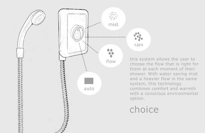
Here is my final project for Studio-Designing for Water's Future.
My group's work is pictured below...Mist Opportunity.


WABI-SABI is the Japanese art of finding beauty in imperfection and profundity in nature, of accepting the natural cycle of growth, decay, and death. It's simple, slow, and uncluttered-and it reveres authenticity above all. Wabi-Sabi is flea markets, not warehouse stores; aged wood, not Pergo; rice paper, not glass. It celebrates cracks and crevices and all the other marks that time, weather, and loving use leave behind. It reminds us that we are all but transient beings on this planet-that our bodies as well as the material world around us are in the process of returning to the dust from which we came.

Here are some key points of Wabi-Sabi...
An intuitive world-view
Relative
Looks for personal, idiosyncratic solutions
One-of-a-kind/variable
There is no progress
Present-oriented
Believes in the uncontrollability of nature
Romanticizes nature
People adapting to nature
Organic organization of form (soft, vague shapes and edges)
The bowl as a metaphor (free shape, open at top)
Natural materials
Ostensibly crude
Accommodates to degradation and attrition
Is comfortable with ambiguity and contradiction
To every thing there is a season

10 December 2008

Seasons Greeting!!! Here I am decorating our tree ...

Here is a layered illustration I made of origami kites ... it is drawn on velum, so that each layer shows through to the next ...

The winter wonderland I walked out into after class today ...


3 December 2008

Here are the first few slides of our final studio project-
Designing for Water's Future.
These are the first few slides that I have completed, more to come.


19 November 2008

Final Studio project...Designing for Water's Future. This was my original idea (below), but we are working in groups now and our topic has shifted. The idea behind 'Putting Your Lawn To Rest' is about encouraging people to turn their yards into a more sustainable and water-friendly alternative. Lawn watering makes up for almost 40% of a household's water consumption. By creating an interface(website) for do-it-yourself landscaping, people can choose templates that match their yards, pick their growing zone and choose from native species of plants to design their yard. Native species of plants require little to no watering, so at a household level, this would dramatically cut water consumption.

18 November 2008

Another studio project was to design for re-service. We were to identify an existing under-utilized resource within the urban environment and re-think the way in which it could exist as a service to a community. My idea (below) was to take bio-waste from supermarkets and plant/flower wholesalers and growers and compost it into nutrient rich soil for reuse at a community level, i.e. local farms, creating a loop in the cycle between waste and food/plant production.


"Most cities are linear metabolic systems in which resources flow in and wastes flow out, unlike natural ecosystems in which resources are cycled in the system. Thus, cities need to close material cycles and adopt a more circular metabolism With the recycling of paper, glass, metals, and plastics, thetreatment and reuse of wastewater, and the composting of organic wastes on local farmland. For cities to be more autotrophic within their bioregions, their inputs and outputs should more closely match bioregional capacities. That is, more inputs should be gained locally and bioregionally, and wastes should be recycled at the local and bioregional scales." (Girardet 1992, 2001)

"In a bioregional world we would see much more of our needs met through a local and regional food supply system based on low input and organic agriculture. The food would be produced on local, efficient, mixed farms, producing a diversity of crops, and where animal manure can be used as fertilizer for crops. The food produced on these farms would be delivered through efficient regional packhouses to regional distribution centers for delivery to supermarkets, or direct supply to consumers. Composted food waste and sewage would be returned to these same farms to create a closed-loop cycle." (Desai and Riddlestone 2002)

12 November 2008

My most recent design project was to find an object of mass production and manipulate this object so that it fulfills a completely different function. My partner and I took a straw cowboy hat and turned it into a whisk. The transformation is pictured below.

8 November 2008

Here is some of my artwork inserted into gallery and shop settings. I made these with photofunia.

6 November 2008

Another one of my studio projects was to create an object that facilitates the body at rest.

Myself and another student came up with a simple organic shape made out of steel and shaped to support the curve of your back-we named it dos (pictured below).


dos engages two people back to back, or dos-à-dos. Supporting each other and leaning back into each other; one shape for two to relax into.

5 November 2008

Designers ünal & böler describe their budak shelving (pictured below):

"budak" means “knot in timber”. System starts growing from single unit to form seating and shelf structures without using any fixtures or screws. Each element acts as a locking piece by itself. The structure becomes more rigid with every element added on each other. System can be used where a quickly recomposable shelving and seating is required such as shops.


My Beautiful Backside (pictured below) designed by Nipa Doshi and Jonathan Levien for MOROSO.

Nipa and Jonathan have this to say about their new design:

“My Beautiful Backside is a collection of seats whose backrests are a composition of highly coloured, floating cushions in various shapes. The wider your seat, the more cushions you can have. Our use of oversize symbols, such as the buttons on cushion backs, is a way of conveying a variety of messages. These symbols also provide a means of customising each chair, making it unique, just as you would add little distinguishing touches to an article of clothing. We used a new wool fabric designed by Giulio Ridolfo for Kvadrat. We teamed it up with felt because it's a combination that reminds us of old-fashioned clothes with stiff starched collars. We also designed a new daybed, called Princess, with layers of mattresses. The top mattress is covered with a composition of different objects and since they draw inspiration from a modern princess they're embroidered in gold and silver."


Designer Tokujin Yoshioka's Bouquet chairs (pictured below) for MOROSO.

He likes to astonish us by producing surprising effects from simple, almost banal objects which he interprets and uses in an extraordinary way by means of his ability to see beyond and to reinterpret the world through the characteristic poetry and harmony of Japanese culture.


Demelza Hill's Snap and Dine (pictured below) is "an injection-molded-yet formal-place setting intended for use by a single diner on the move."
-Surface Magazine

One of my design projects was to create an instillation that articulates some aspect about day and night. Myself and another classmate created an instillation located in our studio. We built it coming down from one of the overhead fluorescent lights. Outside, it was meant to be an oppressive and massive shape and inside was meant to be organic, chaotic, and claustrophobic. We built it to function similarly to an accordion-where it could flex when people stood up with their head inside of it.

Here are the mechanics of the giant accordion shape...

Here is the underside of the shape...

Here is the inside of the shape...

And here it is in action...

1 November 2008

Street Art in Calgary ... Some photographs I've taken ...

More unusual Street Art...

Joshua Allen Harris' Inflatable Bag Monsters

Slinkachu's Little People - a tiny street art project

25 October 2008

Trying to find inspiration for my Halloween costume, I am going as a peacock, I came across this photograph of a fabulous peacock-inspired ballerina costume!!!


I also came cross Elsa Mora's blog looking for bird costume ideas...her paper cuts are amazing, some are pictured below...


23 October 2008

Free Spirit Spheres

"There are a lot of trees here on Vancouver Island although the majority of them are second or third growth. The majority of first growth forests have been logged. Even when city folk move out into the country the first thing they do is clear at least a 30 m square piece of land to build their house on. Then they build a concrete foundation and up from there. The destruction mounts quickly.

I wanted something different. To enable people to move into and inhabit the forest without taking it down first. To live in and among the trees and to use them for a foundation. In this way the foundation depends on maintaining a healthy ecosystem. It also gives me back a magic environment right outside my front door. Like a bird in a nest."

-Tom (Inventor, Manufacturer and Distributor of Free Spirit Spheres)

11 October 2008

Over the past two months, my design class has been working with paper and MDF. MDF isn't the best material, but it is cheap and has given me new insights into using wood as medium and using it to understand new concepts in design, such as spatial relations, space, flow, foreground, and transitions.

Here is a spatial exercise that we completed using MDF and wooden cubes.


Wood Pixel takes the kitsch idea of pixel pictures and turned it into an activity of arranging wooden cubes. It reminds me of the spatial projects from my design class. By arranging the six different kinds of wooden cubes on a wooden grid base, you can make patterns or pictures reminiscent of childhood characters, symbols of just fun patterns.


Here are a couple other projects from design studio, one is a self-portrait...


Torafu Architects' use of wood in design is fun. The Boolean Cafe at the University of Tokyo-designed using circular cut-outs of wood which form a seating area and partition pictured below.


I found this image by searching for wood and design. I loved the assembled and layered look of the table.


The photographs of Kenshu Shintsubo are simple, quiet, and stunning. I really enjoy how he showcases and contrasts two photographs side by side to show changing seasons and subtle similarities between nature and humans. Beautiful!!