26 June 2010

Just showing some work in progress - here are some colour and texture swatches for my book project. I will cut different shapes out of these swatches, like leaves, grass, sky, clouds, tree branches and tree trunks ... and assemble the cut outs to form the illustrations of the book ...


Next, I think I will draw out the outlines for each page and make sure the edges line up ... those images soon to come ...

23 June 2010

Hello! This evening, I finished doing a simple sketch/storyboard of my little story: "look up, look down" ??? I haven't really decided on that title yet, but I'll use it for now ... The entire story can be found below with the page breakdown as well ...


I'll tell you a little about the story - it is meant to show the cyclical nature of growth and seasons ... shown in the growth of a tree. This theme is reflected in the design of the book as well. The book is meant to have no beginning or end, the illustrations bleed into the next page, including the last page that starts the story again ... When printing, I don't think I'll print as a typical book with turning pages, instead I think an accordion style is more appropriate, so that the book can bend and circle back on itself.


Here is the story:

1.Look up, way up in the sky
There is the sun that glows and glows

2.Onto a seed that grows and grows
With the warmth of the sun that glows and glows
From way up in the sky

3.This is the tree that's growing and growing
From a little seed that grew and grew
With all that help from the sun's glowing and glowing
From way up in the sky

4.These are the branches, reaching and reaching
Up and up from the tall, tall tree
That has grown and grown from a tiny, little seed

5.These are the leaves, shiny and green
That have sprouted from those branches
Of the tall, maybe tallest, tall tree

6.All that growing and growing takes a lot of energy
The tree has gathered it up all this time
From when it was a small, maybe smallest, small seed
From the glowing, glowing sun way up in the sky

7.Now, raindrops collect in those lofty leaves
And the water drains all the way down
The branches of the biggest tree of trees
The tree needs all this water to grow and grow
and with the warmth from the sun,
The tree is sure to, you know!

8.But after some time, it turns icy and chilly
And those leaves shiver and wither away
They fall one by one from the tree

9.That is still reaching, but empty-handed today
The tallest tree, all bare now, still stands proud
And the sun embarrassed hides behind a gray snow cloud

10.Look down, down on the ground

Those tired withered leaves
All around the tree surround
Like a giant comfy blanket
Keeping the tree's roots warm in the ground

11.And so the tallest tall tree
Through winter stands warm and proud
[Well maybe a little chilled]
Through the chilliest season
Until the sky is once more sun-filled

12.Look up, way up in the sky
There is the sun that glows and glows

13.Onto a new seed that grows and grows
Under the shade of the tallest tall tree
From the branches that reach way up high
Sprouting new leaves in the warm sunny sky

14.That wave and dance

15.Or drain rain down when its gray and cloudy
Down and down the tree
To the newest new tiny seed

I have started painting sheets and sheets of paper with many different colours and textures, which I plan to cutout and assemble into the book's illustrations ... I will show the progression of the book from start to finish ...

21 June 2010

Inspiration: Botanical names and illustrations. Here are some maidenhair ferns that I picked on our nature walk. I have scanned them, I like the light and dark effects created by scanning, especially with anything botanical ... Click on image to view ...

Adiantum capillus-veneris (maidenhair fern)

I am reading this book: 100 Flowers and How They Got their Names by Diana Wells. After all, "Weren't names designed to enhance the matter in which they referred? (Bernard Cooper, Maps to Anywhere, 1990, 4) I wish this were true - I am finding that most botanical and family names of flowers are Greek origin with mythological stories to match; which is interesting. Whereas the common names are often named after botanists and not relating to the flower's characteristics or habitat or cultural context; this is not so interesting.


However, the Foxglove's common name, it's meaning and history are not only interesting, but quaint. Wells (1997) writes:
Foxgloves, native to Britain and Europe, have always been considered fairy flowers. There are dozens of fairy names for them, as well as some more sinister ones like the Gaelic ciochan nan cailleachan marblia, or "dead old woman's paps". The name "foxglove" comes from the Old English foxes glofa, and the flowers do look like the fingers of a glove. Foxgloves tend to grow on woody slopes where foxes' burrows are often found. Foxes are wily creatures who may have needed magical gloves when they slunk out of the shadows and spirited away chickens... William Curtis, whose illustration of a foxglove was the frontispiece to Withering's book, compared the flowers to spotted wings of butterflies, which "smile at every attempt of the Painter to do them justice"... (77-78)

(Foxglove -photo courtesy of Old Varieties)

20 June 2010

Inspiration: Nature. For Father's Day we went on a two hour nature walk as a family ... It was such a nice walk around the river with a cool break under a shaded tree ... I took some of the shots from our walk and made these...

I made a couple variations of this photograph of crows sitting on a wire ...


And combined this photograph with another I shot the other day ...


And here are some flowers I picked up at the Farmers' Market this morning ...


19 June 2010

A couple pictures I took outside of Bragg Creek today - a sunny pasture with llamas and horses ...


Check out chealseArt ... Chelsea Groves makes bird art (collages + linocuts) Here's a sample of her collage work:

(wedding wrens 11 x 14)

Jessie Chorley's Mon Marriage is a beautiful vintage + antique inspired wedding collection. Here is a selection from her wedding range:

I especially like this piece, silk corsage ...

18 June 2010

Inspiration: cloudy skies, cityscapes and chaotic illustrations.

This afternoon Leo and I walked down to 17th Avenue so I could photograph my project site. It was a cloudy day, but I like photographing when it's overcast best, its like a natural filter so you don't have to worry about harsh light. Here are some shots I took along the way ...


This amazes and inspires me - I read this article 'Favela Painting by Haas and Hahn' by Frame Magazine:

Haas and Hahn create a community driven artwork spanning over 34 houses, by painting the favela Santa Marta.

In the heart of a favela in Rio de Janero – called Santa Marta – a huge art project has given colour to the streets. The artwork aims to brighten up the neighbourhood, giving the community a boost by educating and employing workers. The project is an initiative by Dutch art duo Jeroen Koolhaas and Dre Urhahn.

Haas en Hahn (hare and hen) as the artist call themselves, made a flexible design of colourful rays that can easily be expanded, to paint the houses around the central square. A group of locals were trained as painters to work with scaffolding and different materials; during the month it took to paint the buildings, they received training as well as a pay check.

The final artwork is a monument to the community living in the slum. The artists’ goal is to transform the whole hillside favela into one big colourful area, turning it into a community-driven artwork and helping inhabitants on the employment ladder.


(Photos courtesy of Favela Painting)

Natsko Seki is a Japanese mixed-media artist who creates these cheery, fanciful and chaotic cityscapes. She finds inspiration in antique and vintage culture, as well as nostalgia. I love the aesthetic of her work - it is inspiration for my own cityscape project. I especially like these works by Natsko:


(Map of Clerkenwell, 2009)

Mike Perry's illustrations and designs are chaotic -a mix of graffiti, graphic design, poster and street art ... I love it ... there's a sample of his work below and see more here.


Tomorrow we are off to Bragg Creek, so I'll share some pictures from that day trip soon ...

17 June 2010

Last weekend we went to the lake. It is always nice to get out of the city, and anything to get out of the house when you have a little one is especially nice!

Check out this post by Blair Marie Photography ... pictures of my little man at the cabin! Here is a sneak peek - one of the pictures she took of Leo.


I was really taken by this post by Lisa Solomon (her blog: Lisa's Musings) She is an artist and a mom, and her post on the subject put everything I have been thinking and feeling for the last year and a half in words. Here is an excerpt from the post:
people sometimes ask me what it's like to be an artist and a mom. this was something that i thought about - A LOT - before deciding to have a child. i knew that being a mom would become the most important thing and that i would have to learn how to juggle and struggle in new ways. in all honesty - it wasn't even possible for me to fathom how this would all work - even on my best days of guessing. there is no way to know what temperament your child will have [on a day to day basis let alone overall] - there is no way to know how you will respond to demands of parenthood. i was determined from the get go that i would still make art. and i'm managing to do that, but it feels like it's by the seat of my pants and the skin of my teeth.
She doesn't paint motherhood as rosy. She is telling it how it is and I feel for the first time some relief that I am not alone.

It is amazing to witness a baby grow before your eyes. Leo and I have had three photo shoots, all being very different. Here are some of my favourite photographs from them. I love seeing the changes between them ...


(sleeper is Marimekko)


Christine Jordan wrote this about Leo about two months after he was born. Check out her blog Growing Up Toronto

Little Leo Walker

He’s Little Leo Walker
He’s got a shiny quarter
For helping out his Mommy and his Dad
He really thinks it's awesome
This isn’t his first one
He’s even got a special place for his change

On top of Leo’s dresser
Is a majestic tree
It’s made of glass from the beach
And the salt from the sea
It’s a lovely thirsty green and it's almost see through
And when he drops his change in
It’s like he’s planting tiny seeds

When it fills right up
He’ll have his first money tree
And there are lots of great things he can supply
A chicken for his coop
Or some candy for his tummy
Or a bell for his little doggie's collar
Maybe groceries for families who really seem to need it
Or some paint to create-another something great
Or new tires for his really fast bike-might be nice
Or nothing is quite alright too!

He can give, he can share, or just save some more
Since this world is his planet
There's nothing good he will ignore

16 June 2010

Inspiration: airplane. Here are a couple illustrations I worked on last night and this morning ...


I have blogged about studio mela before - I love her posters!!! Here are a couple of them:

(Don't wait for tomorrow)

(Love is Everything)

See her work ... studio mela blog or here

Here is how she describes herself: i'm an artist. i get paid to draw. i love what i do. i'm also a wine lover, a beer hater. a mommy. a dreamer. a writer. but above all i'm really just a girl who lives a lovely little life. this is a space to keep the good. the deep. the funny. the amazing. the small. the big. the best.

Redbean Design - the portfolio of San Francisco based designer and illustrator - Melissa Crowley. Melissa's work includes identity, print collateral, stationary, website, packaging, event, apparel and surface (wall, textile, decor, paper) design.

(hatch and terrarium pillow cases)

Tamaishi Kayo is a Japanese artist. She studied art with Setsu Nagasawa, one of the preeminent Japanese Fashion illustrators. Kayo's work includes water painting, book cover design, magazine illustration, T-shirt design and more. Here is one of her illustrations:

(What are you thing? 2007)

15 June 2010

Inspiration: love quotes and an antique wedding theme.

Here are a couple new images I have been working on. I added this love quote:

When you are in Love you can't fall asleep because reality is better than your dreams. - Dr. Seuss


I love wedding work, especially making wedding bouquets. This is the first wedding season in over ten years that I am not doing wedding work and I am really missing it! Here is a little sample I put together, the flower bouquets and the lollipop image are my work ... the other images are not, but I'm using them to show a colour palette of pinks and blues.

The best thing about me is you.
-Shannon Crown

14 June 2010

Inspiration: lollipops, carnival, old floral paper and postcards.

I am feeling better about these images now ... I decided to include them into triptychs with old postcards and their messages. I think they are better suited now than with the old sketch I was working with before.

Here are some pictures of what I worked on last night. See my set carnival & postcards for more pictures ...


13 June 2010

Inspiration: lollipops, a sketch from 2001 and old floral wallpaper. I worked on some new illustrations, this time throwing a lollipop into the mix and I ended up with a funny pattern ...


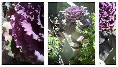
I finished planting the garden yesterday ... here are some shots ... this year we mostly planted in pots and containers ...


The best antique shopping is in Saskatoon, SK. I found these random pictures I had taken years ago and had long forgotten about them ... I love displays in antique stores - mix matched, random and cluttered ...